File Guidelines
These are some tips of getting the highest quality printed product. These include preferred file type, which is Adobe® PDF. The best size for the type of product it is, and to include bleed margins. It also includes color spaces and tips on checking graphics. We want your graphics to look the best that they can and which is why we put together these file tips and guidelines.
Preferred File Type

Adobe® PDF (Portable Document Format) files are the preferred file format. You can create PDF files from any professional graphics program and properly prepared is going to eliminate font and platform issues. We recommend creating or saving PDF files using the "Press Quality" preset, this creates a High Res PDF file that includes fonts, images and spot color definitions. After saving your file with these settings it should open up in Adobe Acrobat where you can take one last look at your art before sending it to us. Have the Overprint Preview or Output Preview window open so you can check the color breaks, separations and any overprints to ensure the file you are sending will print correctly. Be sure to embed the fonts in your Adobe® PDF file; however, due to licensing restrictions, some fonts will not embed. Converting type to outlines before creating the Adobe® PDF file will eliminate problems with these fonts, but we will not be able to make text changes to your file. Always save multiple or double sided orders in one PDF file on multiple pages. This will make transmitting easier and faster, which is why the PDF file type is preferred.
Preferred Size and Margins of File

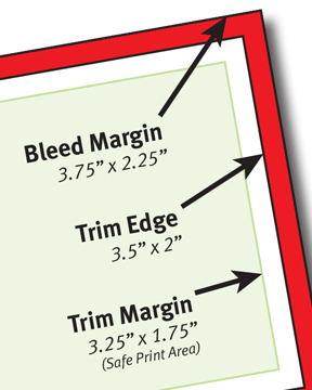
Send in all files one up, without cropmarks or borders/frames, to the size of what the final piece will be unless your image bleeds and/or you are uploading art on our Web Only Pricing Page, which in that case 1/8" needs to be added to your art file. Set your layout program page size to the appropriate size before starting your design. For a business card, that size is 3.5” x 2”, which is the Trim Edge. When creating your PDF file you can adjust Bleed Margin under the Marks and Bleeds tab. The Bleed Margin is 1/8” outside the Trim Edge. This allows for images to extend off the edge of the final product and for trimming the excess. It is important however, that no image or text be in the Bleed Margin area. The minimum Trim Margin is 1/8”, the recommended is 1/4” inside the Trim Edge. This allows enough space between the Trim Edge and the printed image for an aesthetically pleasing product after trimming. For all other products such as Letterheads, Envelopes, Forms etc., the Trim Margin should to be a minimum of 3/8” to allow for enough grip edge on our offset presses. For Digital Full Color jobs, the minimum Trim Margin can be 1/4” from the final Trim Edge.
Preferred Color Spaces

For spot color jobs be sure to use ink colors from the Pantone Matching System® (PMS). Also check to make sure the exact same ink color names should be used throughout your document, use 100% Black for Black Ink, and 0% Black for White areas and that the proper use of overprinting is set. Checking this is simple in Adobe® Acrobat in the Overprint Preview or Output Preview window. Use only PMS colors that are to be printed in your file. Our Standard and Economy Colors are matched from the PMS system but we offer the full range of the Pantone Solid Colors. Having a PMS chart on hand is important for matching colors because on screen colors are not accurate. For Full Color printing it is suggested you use CMYK or PMS colors when creating your file. Remember that colors printed on colored stock will look differently and colors will not exatly match what you see on your screen. All colors are matched on white stock. In the PMS Color System the C, M & U (Coated, Matte & Uncoated) at the end of the color number indicates the stock finish. Using the appropriate finish indicator in your art file will better match the color you prefer. If color is critical, we recommend a picking a Pantone Matching System® Color.
Check Your Graphics

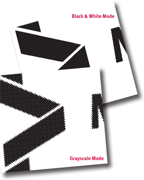
When using graphics in your layout program, the recommended DPI for all raster or bitmapped images, such as Adobe® Photoshop JPG, TIF and BMP files, is between 600-300. To prevent text and logos from appearing grainy when printed, save all text and line art as Black & White Bitmap and photos as Grayscale. A low resolution file or image will produce a jagged, blurry appearance when printed. Raster images downloaded from the internet can be the most problematic due to resolution. Vector images such as Adobe® Illustrator EPS files, can be enlarged without affecting the quality because these images are made of paths, or strokes. With this type of graphic, the clarity and sharpness of lines are perfect making this best suited for type, logos and line drawings, as apposed to raster images which are best suited for photos. Another benefit of vector images is they can be saved with PMS colors used in the file for more control and color consistency. This allows them to print as both spot and full color due to their ability to color separate.
Alterations or corrections that we make to your file will incur extra charges.
